Today on my one-year anniversary at Brooklyn Paper I’d like to address a less weighty topic than some of my others: Brooklyn’s flag.
Brooklyn’s flag design is quite old, dating back to about 1860 — 38 years before modern New York City was born in the amalgamation of different large neighboring cities into the five boroughs.
Changing flags mostly happens when the entire type of government changes. In the last 30 years, South Africa changed flags when it became a multi-racial democracy and Russia’s flag is a very different flag than what the Soviet Union had. Probably the biggest flag change occurred after the French Revolution. The iconic blue, white, and red tricolor has always symbolized the French Republic, replacing monarchist flags that feature the House of Bourbon’s gold Fleur de Lis.
But sometimes places change their flags for simple branding reasons. For instance, New Zealand nearly changed its flag recently, because its current flag too closely resembles Australia’s. Without a new flag, it can be very hard for many outsiders to tell Australia and Australia’s Canada apart.
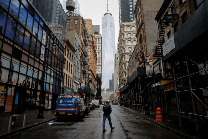
Brooklyn has had a number of rebrandings in the last few decades, because we are such a different place than we were 50 years ago. Changing our flag is a part of changing our historical second-rate status.
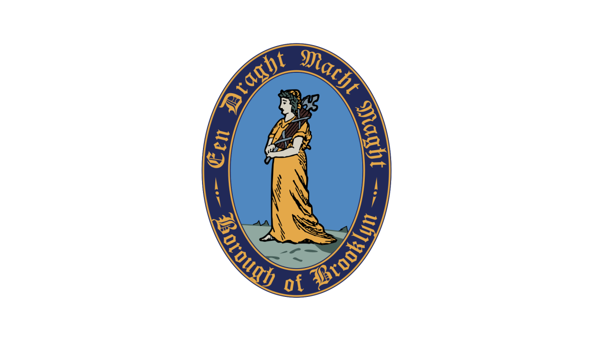
It’s just a boring and difficult-to-reproduce flag. It’s the seal of the borough on a white background (the background of the flag is called “the field.”) I will quote Wikipedia’s description:
“Within the seal is an image of the Goddess of Justice set on a background of light blue, and bearing fasces, a traditional emblem of unity. The fasces is composed of six rods, representing the six towns of the original Dutch settlement. Encircling that image is a ring of dark blue and the Old Dutch phrase ‘Een Draght Maekt Maght’ (modern Dutch: ‘Eendracht maakt macht’) which translates into English as ‘Unity makes strength.’ Also in the darker ring are the words ‘Borough of Brooklyn.’ The outside and inside rim of the seal are gold-colored.”
Who is the Goddess of Justice? The flag honors the borough’s Dutch heritage not by using the handsome blue, white, and orange of the Dutch tricolor that forms the basis of the city’s flag but instead archaic Dutch words about unity. Words should be used very sparingly on flags. Also, nowadays, the Roman rods called “fasces” conjure up not legitimate government and unity, but, er, fascism.
What should our new flag look like? I am not a graphic designer, and have poor visual sense. I have two suggestions, though. First, it should include substantially more black than we normally see on flags that aren’t the Jolly Roger. Black to me symbolizes creative focus, winning, and, with green, is the symbolic color of the African diaspora. Second, the flag should include only two words, in English: “Spread love.”
It’s the Brooklyn way.